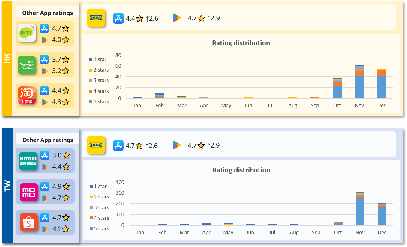
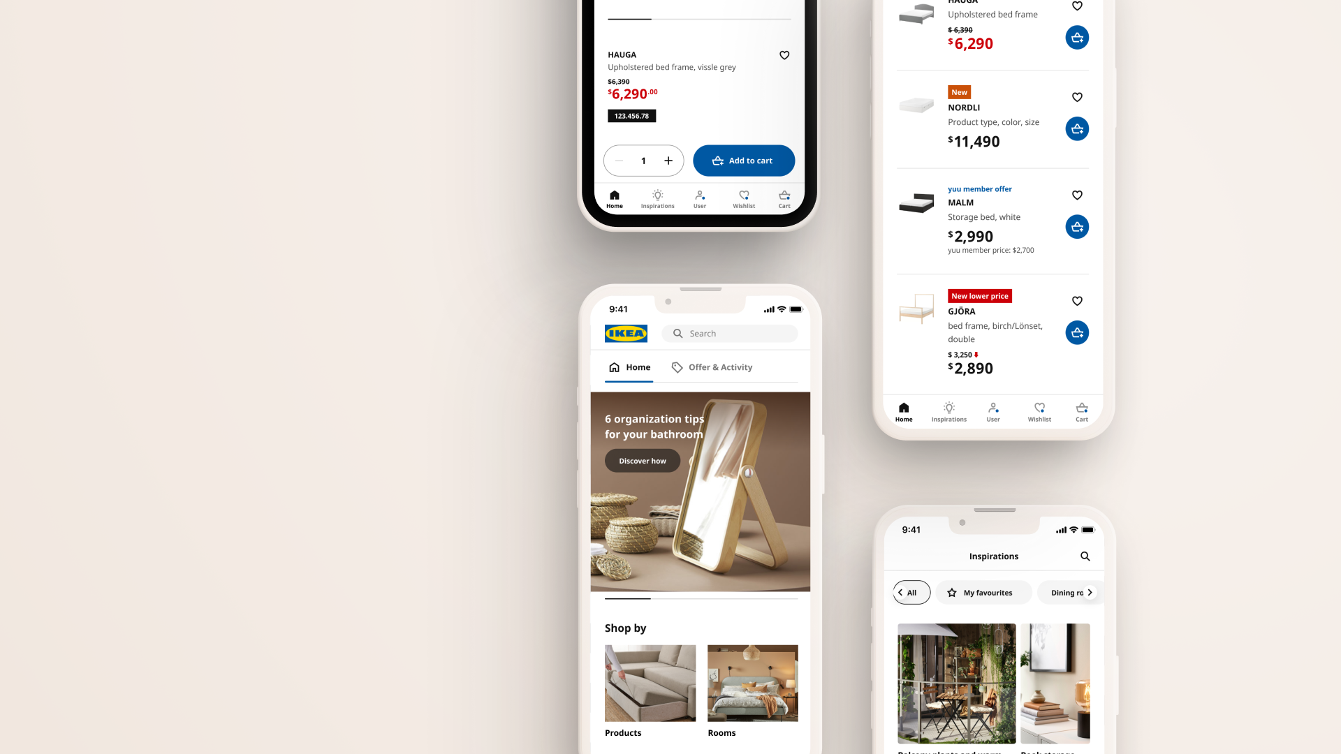
The app revamp was initiated in response to low average ratings of 1.3 stars in HK and 1.8 stars in TW, as well as the use of webview, which contributed to a poor user experience. The goal was to create a more user-friendly design and enhance overall user satisfaction and rating.
4+/5
App Rating
+
20%
User retention
+
30%
positive user feedback
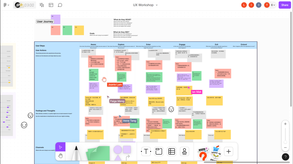
In our app revamp discovery process, we conducted a workshop to uncover and prioritize pain points. This collaborative session involved stakeholders and users, providing valuable insights that guided our strategy and prioritization of enhancements for an improved user experience.
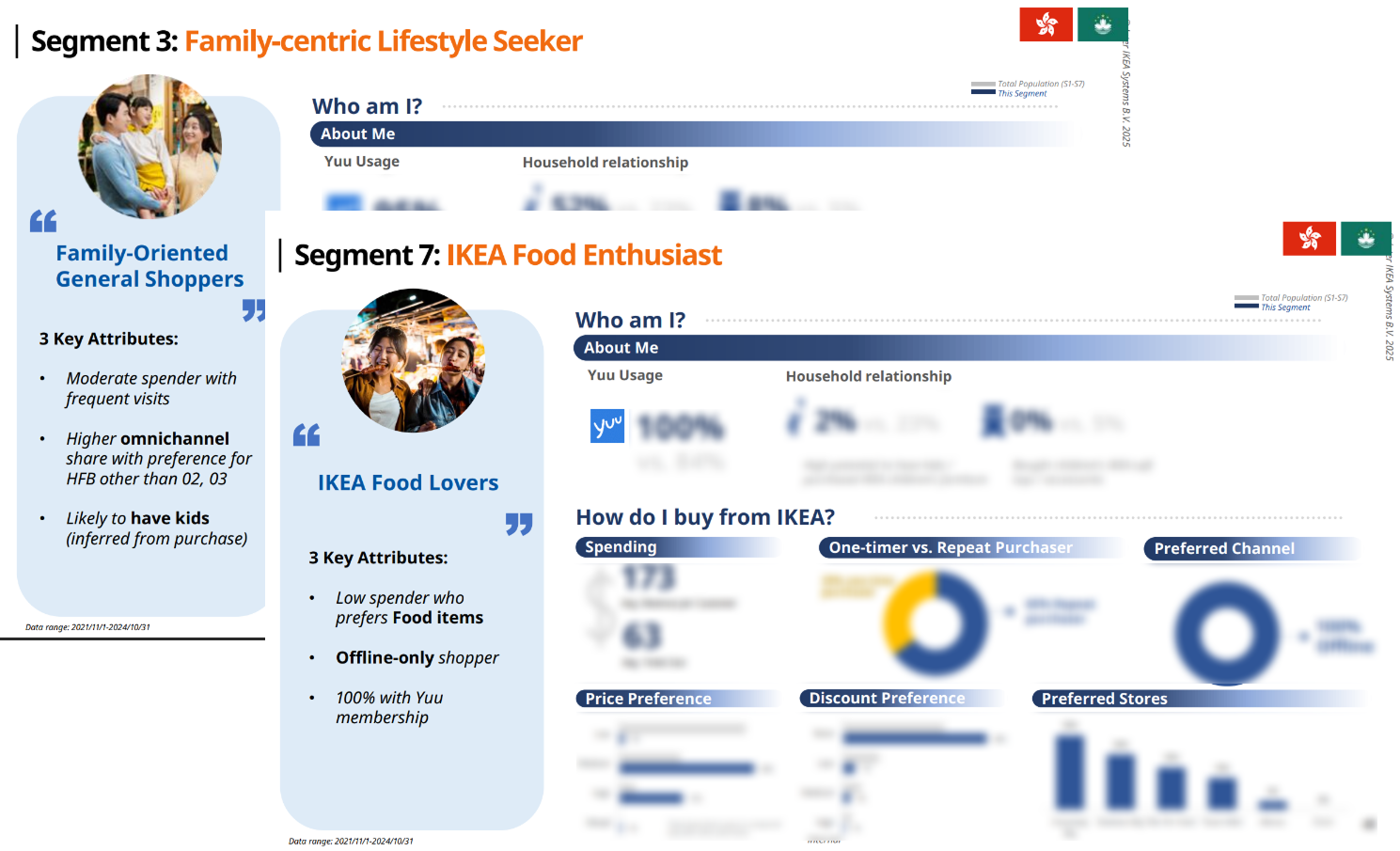
Building on these findings, we crafted research‑based user personas that captured our core users’ goals, behaviors, and frustrations. These personas gave the team a shared mental model of who we were designing for, helping us align product decisions and app revamp concepts around real user needs rather than assumptions.
Users struggle to complete key tasks because navigation and flows are confusing
The visual design and patterns no longer match current standards, making the app feel less competitive.
Slow performance and non‑responsive layouts create friction, driving negative reviews.
Based on the prioritized pain points, we set three design goals: simplify task completion, surface key actions earlier, and create a more trustworthy visual language.
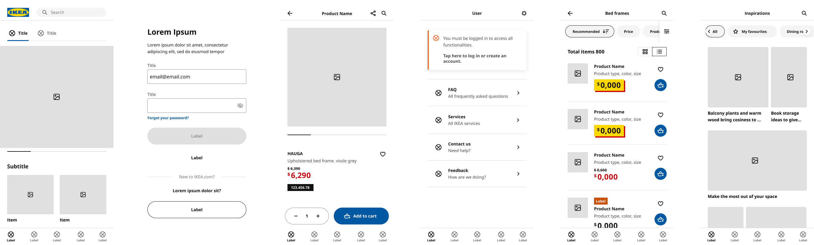
I explored several low‑fi wireframes and ran quick A/B tests with coworkers (E.g., sticky vs inline “Add to Cart” button), using completion rates to pick the stronger pattern. Once my colleague and I aligned on the direction, we moved on to designing the full flow.
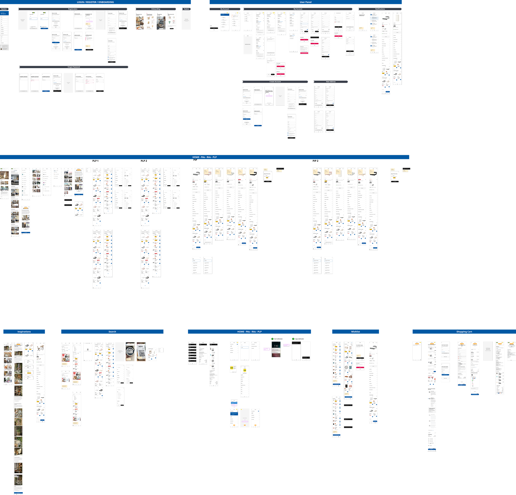

Achieved a 23% surge in positive qualitative feedback and reviews highlighting improved UX and reliability.

App Store rating jumped from 1.8 to 4.6 stars post-launch.